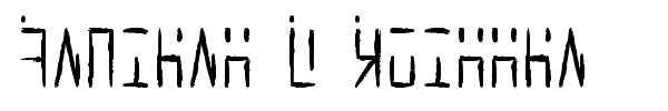
Ancient G Written font by Gen Aris
This is the page of Ancient G Written font. It was created by Gen Aris.
This font is free and can be used without any restrictions. It was published on Fontzzz.com on Wednesday 21st of March 2012 at 07:57 AM and was placed in the "Dingbats - Various" cattgory. Version of the Ancient G Written font is "Version 1.00 October 2, 2008, initial release". You can download Ancient G Written font for free by clicking download button. This font was comressed in a ZIP archive for your convenience. It contains 1 font files.
Note of the author
A variant of the ANCIENT glyphsets used by the Ancients in Stargate: Atlantis.
This version is designed to provide a HANDWRITTEN variant of ANCIENT G MODERN, which is my extended character version of the machine-print styled revision of ANCIENT.
The purpose with this revision, as in Anc. G Modern, is to CREATE PUNCTUATION and ADDITIONAL CHARS/SYMBS to facilitate better clarity when applying this font to English documents which contain punctuation and other characters. Of course, this WRITTEN variant stylizes the glyphs to facilitate hand writing them more readily. Some glyphs here are more identical to the source than is possible with others but hopefully, once used a bit, will become intuitive for those familiar with Ancient and or Ancient G Modern.
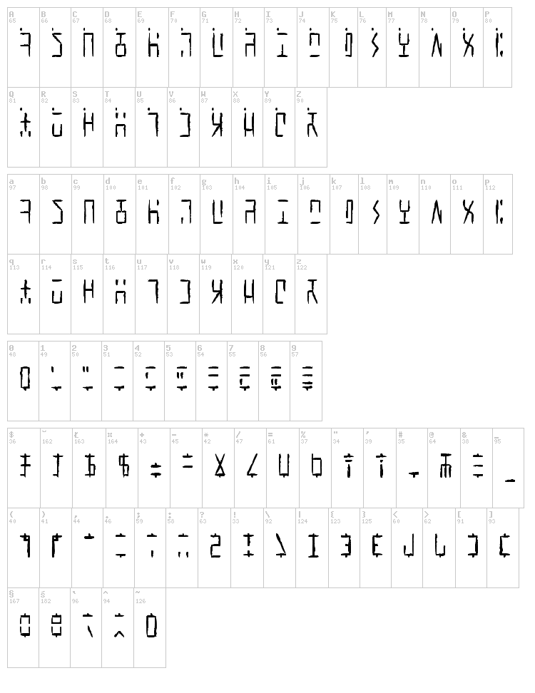
Per show canon, the Ancients did not appear to use punctuation marks, nor did they distinguish between Upper/Lower case. Again, to facilitate use of this font in regular documents or even as the Windows font (for menus etc) I have created CAPITALIZED VARIANTS which are identical to the lower case except I added a SQUARE DOT FLOATING ABOVE TOP LEFT of CAPPED KEYS. Passwords and user names sometimes use L/case and U/case letters, so it is necessary to distinguish the 2 cses in daily life here on Earth!
My logic for the design of new characters is as follows:
Letters are made up of white/black blocked spaces dividing on a 3 wide by 4 high grid. A few letters make use of subdivsions within the grid.
In canon, all numerals share a centered descender "tail" unlike the letters.
I took this further, by giving all punctuation mark glyphs a centered ascender on top, like an upside down version of the numeral tail -- an "antenna" if you will. This should make it easier to become facile at visually distinguishing punctuation marks from letters or numbers.
Some punctuation marks or symbols are used in numeric/math contexts partly or wholly. So, math or number oriented and shared alphanumeric/math punctuations are given the "tail" of numerals and the "antenna" of punctuation/symbols to so indicate the context.
The numbers, in canon, have a slightly more subdivided or even an altered grid used in their design than do the letters. Here, as well, both numbers and punctuation/symbols share this more prominent use of subdivision or underlying grid different from the letter glyphs.
Overall, I tried to adhere to the digital, techno-sensibility of the glyphs as seen in SG-1 and SGA while striking a balance with variations of weight and tone so as to be reasonably attractive, while remaining aware of the need to make this practical and functional. How well I fared toward my goals, I leave to you to decide. :)
Gen Aris
genaris@gmail.com
More fonts:
Created by Lauren Ashpole
Added:
2012-10-09
Views:
5579
Downloads:
206
Created by Intellecta Design
Added:
2024-02-12
Views:
1442
Downloads:
101
Created by
Added:
2018-05-30
Views:
4094
Downloads:
223
Created by
Added:
2021-11-28
Views:
2454
Downloads:
114
Created by Sba Factory
Added:
2012-10-29
Views:
4855
Downloads:
219