Kenteken Smits font by LeFly Fonts
This is the page of Kenteken Smits font. It was created by LeFly Fonts.
This font is free and can be used without any restrictions. It was published on Fontzzz.com on Saturday 25th of February 2023 at 04:47 PM and was placed in the "Fancy - Retro" cattgory. Version of the Kenteken Smits font is "Version 1.000". You can download Kenteken Smits font for free by clicking download button. This font was comressed in a ZIP archive for your convenience. It contains 2 font files.
Note of the author
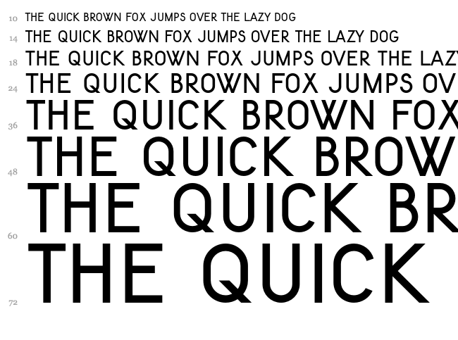
The 'Kenteken Smits' set of fonts represents the typography as used on vehicle license plates in The Netherlands between 1951 and 1979.
I was asked by the webmaster of nummerplaten.info to develop the original drawings from 1937 into a font. These originals were designed by mr J.B. Smits, director of the Amsterdam Institute for Applied Arts Education (Instituut voor Kunstnijverheidsonderwijs).
The name of the font set is in recognition of the original designer.
I ended up developing three versions.
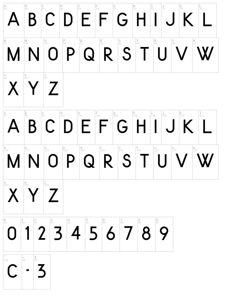
'Kenteken Smits 1937' is a bare representation of the design as shown in a 1937 report on legibility of the design. It lacks C, O, I, Q and Y (these were not to be used on license plates). The character spacing is also as per the original design, i.e. suitable for producing license plates. This version is the most historically accurate of the three.
NOTE: Due to the 'incomplete' character set, 'Kenteken Smits 1937' will not be included in the publicly available download (just use 'Kenteken Smits 1951' instead, see below).
I'll give you this font if you make a voluntary donation through DaFont, though!
'Kenteken Smits 1951' is the font as it was finally used on actual license plates from 1951 onwards. Most notably the character '3' changed form. It also contains 'C' and 'O' which were added in later years to accomodate special issue plates (diplomatic and military). For good measure I completed the character set myself with an 'I', 'Q' and 'Y'. Spacing is still utilitarian. This is the version I recommend for 'typesetting' license plate mock-ups.
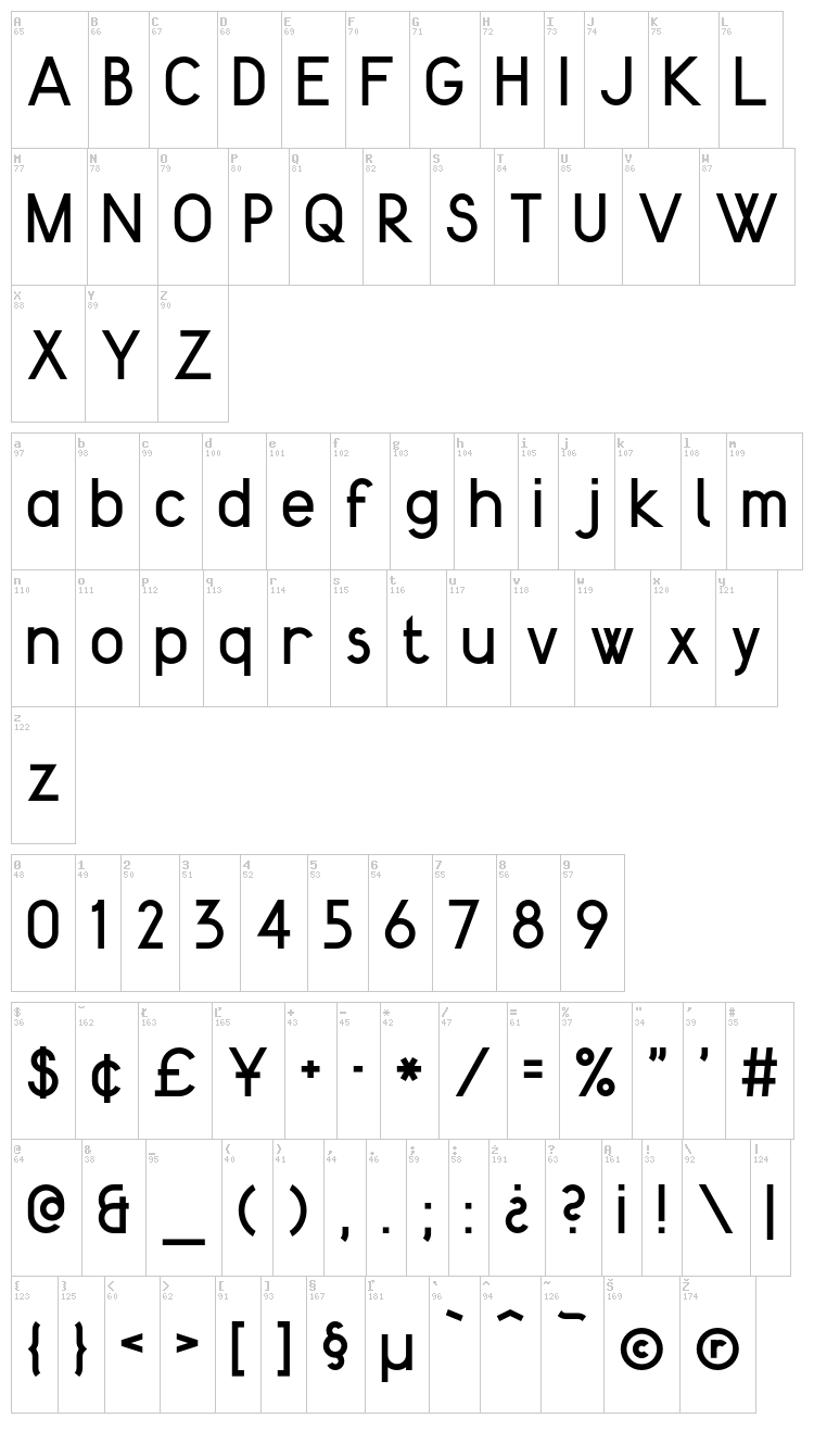
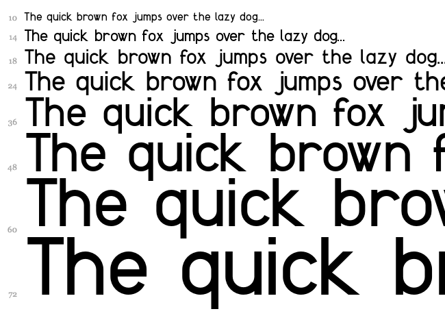
Finally, 'Kenteken Smits 2013' is a heavily expanded version. It contains a complete lower case set, accented characters, punctuation etc. Also the spacing has been adapted to accomodate other uses than 'plate setting'. For anything other than license plate mock-ups, I reccomend using this version.
These fonts are governed by the Creative Commons License: Attribution-ShareAlike 3.0 Unported (CC BY-SA 3.0) [http://creativecommons.org/licenses/by-sa/3.0/]
This means: free to distribute and free to use for typesetting any work (including commercial) without an additional license. Please keep this Read Me file with the original fonts when redistributing.
New fonts developed, derived or remixed from these designs can only be shared under the same license.
Feel free to contact me (lefly.fonts@gmail.com) for any questions regarding this font.
I also love to see how you use these fonts!
Enjoy,
Arthur
More fonts:
Created by Dieter Steffmann
Added:
2013-09-22
Views:
4615
Downloads:
207
Created by E.V. Norat
Added:
2012-08-30
Views:
6108
Downloads:
231
Created by
Added:
2021-10-11
Views:
2512
Downloads:
104
Created by lesley
Added:
2012-11-27
Views:
4995
Downloads:
275
Added:
2013-12-07
Views:
4684
Downloads:
239